
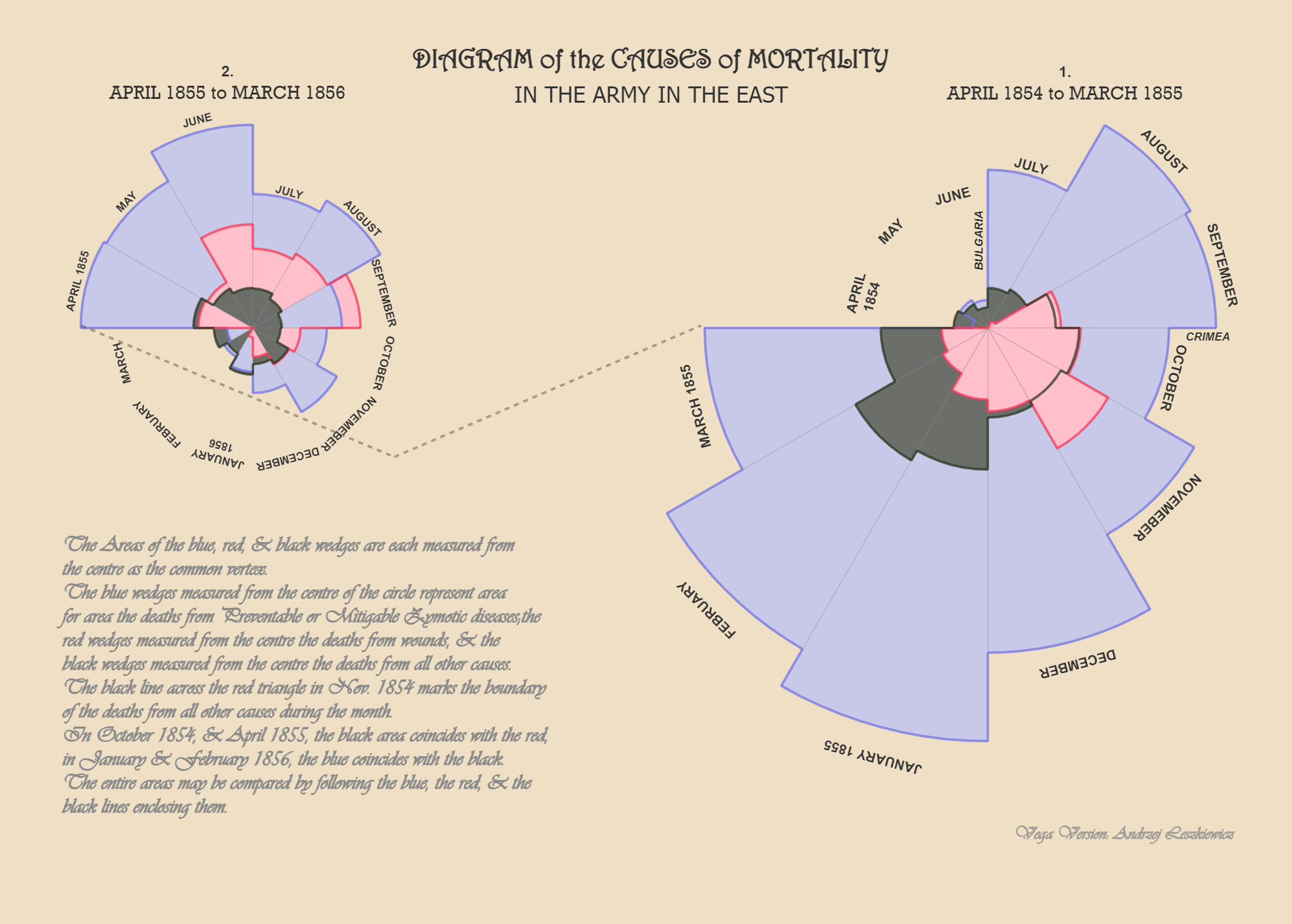
During the Crimean War, Florence Nightingale and her team of nurses confronted appalling sanitary conditions in British field hospitals. She realized that more than battlefield injuries, soldiers succumbed to preventable diseases like cholera, dysentery and typhus; with mortality rates at some hospitals as high as 40%. Better ventilation, waste management and clean water could save lives, but mere anecdotes would not convince military officers and politicians to invest in sanitary reforms. Nightingale understood that standard tables were not eye-catching enough, so she created the coxcomb diagram – now called the Rose Diagram. Designed in 1858, this vivid pie-chart like diagram represented monthly mortality rates in military hospitals, with different colors for deaths caused by preventable diseases (blue), battle wounds (orange), and other causes (black). By presenting data in a compelling visual she made an undeniable case for reforms, cut through bureaucratic resistance and persuaded the British government to overhaul military hospital sanitation, dramatically reducing deaths from preventable diseases.
Nightingale’s Rose Diagram is an enduring lesson that data is not just for analysis but a tool for action. The same challenge persists today – how to make data impossible to ignore. In today’s age of dashboards and endless metrics, senior management need more clarity and not clutter. The art of data storytelling and visualisation lies in shaping numbers into narratives that inspire decisions.
Know Your Audience. This is the probably most overlooked step. Senior leaders are often hard pressed for time, and don’t want to decode complex charts. It is your job to reduce their cognitive load, help them grasp the point, present clear binary choices – a simple yes/no decision and actions they need to take within 30-seconds.
Narrative Before Numbers. Too often people jump right into writing PowerPoint decks, this results in bloated meandering corporate versions of War and Peace. Instead, begin with paper and pencil, write your narrative, sketch how your charts must appear and how the slides connect with each other. Start with the big picture, use simple visuals and keep the data crisp. Don’t worry about details at this stage – focus on getting the narrative right – each slide must tell one story.
Less Is More. In presenting to senior leadership, less is more. With unnecessary details it is easy to lose their attention and walk away from the meeting with assignments but no decisions. You need radical conciseness; thrift everything that’s unnecessary, ruthlessly review every label or detail that distracts from the main story. Truncate long numbers; trim Rs. 4,743,455 to Rs. 4.7M or Rs. 47 lakhs – whatever resonates with your organization. Brevity sharpens impact.
Design With Discipline. Charts transform numbers into meaning; hence you need to be purposeful about the design choices you make; for instance, Line charts are good for visualizing trends over time whereas Bar charts are useful for comparisons. Standard outputs from Excel and other tools often need customizations, invest effort to improve legibility of labels, change axis units to make your chart clearer and compelling. Enforce white space margins across your file, leave 20%-25% of the total canvas as breathing space around your charts to avoid making it look cramped or overwhelming. Standalone raw data is often useless, offer context – versus targets or QoQ. Avoid jargons and abbreviations, provide titles, annotations and callouts for data anomalies or seasonality. Be consistent; while comparing market performance use the same listing order across your file, standardize fonts, units of measurement, currency and time-periods across your document. Limit the color palette i.e. the number of colors used for charts and stick with it throughout the file; charts in random colors appearing from slide-to-slide can be jarring. Go with muted colors, while ensuring legibility and use contrasting colors intentionally to draw attention to key data-points. And for heaven’s sake don’t forget to spell check. If your leadership team prints slides, see how your design choices hold up on printed output – both B&W and color.
Using AI As A Partner. Many enterprise BI suites now come packaged with AI copilots and tools like Microsoft Copilot or Google Gemini can generate visuals instantly. But you must not let AI decide your story. The most compelling narratives combine insights with political savviness, understanding the organization’s priorities and “hot button”. The narrative must remain human and beginning with pen on pencil continues to be invaluable even in this AI-age. Use iterative prompting, don’t accept the first output as final. Use AI as your “sparring partner”, once you’ve written your slides ask AI to critique the document, role-play as a top-tier consultant or your company’s CEO to poke holes or identify gaps. And always remember, you continue to own accuracy of metrics, fact-checking the analysis and strategic recommendations for decision-making.
Florence Nightingale’s genius lay not just in collecting numbers but in making her story undeniable. Data without story is only noise, in a world drowning in data, the real differentiator does not lie in access to data and visualisation tools but in the skill to cut through clutter, reduce complexity and to craft a narrative that demands actions.


Leave a comment